Performance

Full results tables

National Hunt results highlights
Flat racing results highlights
These charts present a picture of how well the models correspond to reality.
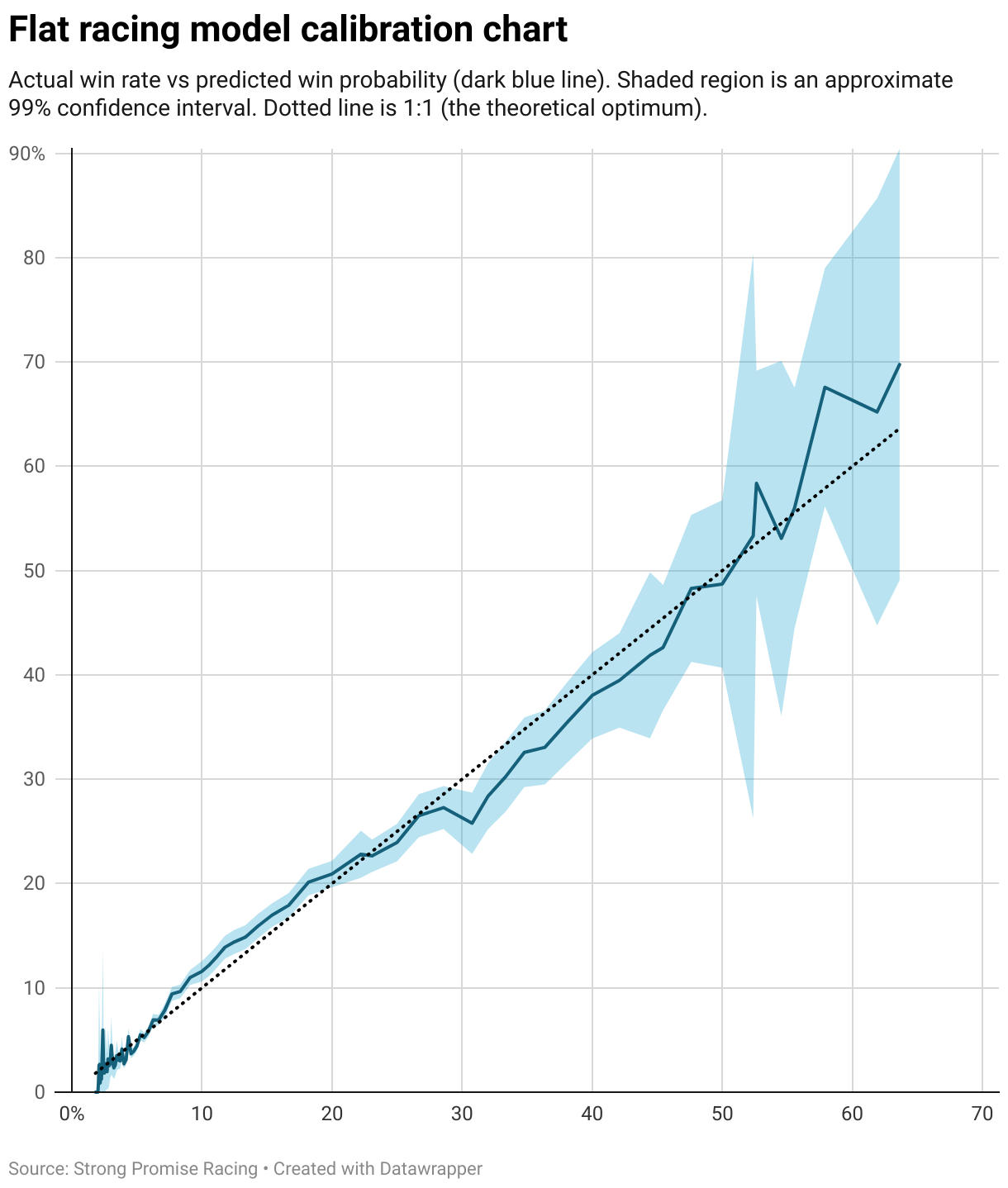
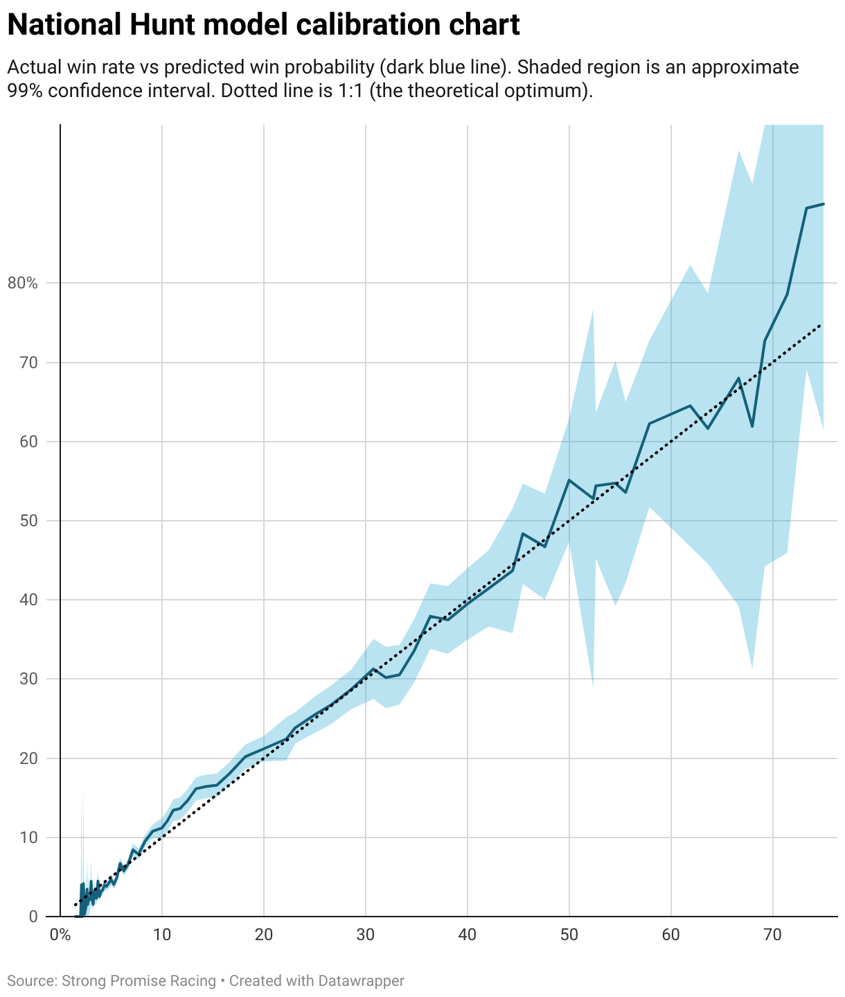
These show how accurate our estimated win probabilities are. The horizontal axis is win probability according to the model and the vertical axis is actual win frequency.
In evaluating our models, it is not fair just to look at how often our top pick for each race wins. One should instead look at whether each rank in predicted outcomes wins as often as we predict it will. This is what is measured in these charts. The dotted line shows what a perfect model would look like: a straight line from the bottom left corner to the top right corner. The blue shaded region represents uncertainty due to limited data.
So what do these say about our models? It looks like our win probabilities are very well calibrated - meaning when we give a horse a certain probability, it tends to win with that frequency - for win probabilities above 20% (4/1 against or shorter). And especially for the flat model. For win probabilities between about 7% and 20% (4/1 to 13/1), we may be underestimating the win chance slightly. For longer odds, the model is more-or-less well calibrated, but it becomes noisy.